Since 2004, the field of “multi-sensory integration of perception”—I’ll give you a moment to make your way through the briars of that phrase—has arisen to explore how humans integrate all their senses when perceiving something. In short, humans don’t determine taste solely based on input from their tastebuds.
This is somewhat obvious: We all know the aroma of a product contributes a large part to what we taste. But less obvious cues are also in play. For instance, “mouthfeel” in spirits can shape flavor.
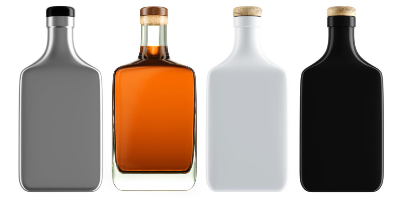
We also taste with our eyes. The clarity of a vodka or the tiger-eye hue of an aged whiskey can actually influence how we perceive the flavor. Visual cues also extend to packaging, meaning bottle design and labels essentially serve as an aperitif to sipping the actual product.
In 2011, Coca-Cola changed some of its trademark red cans to all-white featuring polar bears as part of a campaign to raise funds for and awareness of endangered species. Complaints immediately flowed in about its changed formula. Except there was no change—the product in both red and white cans were identical. But it showed how packaging can influence flavor.
Let’s apply the same science to spirits. The standard backbar or liquor store shelf is a brutish, violent jungle, where hundreds of bottles vie for supremacy and survival. In this case, the spoils go to those that stand out and convey a clear, inviting message: I occupy the top of my range and therefore you should choose me.
Within that ecosystem, I find it interesting that different spirit categories have adopted more-or-less standard design tropes. Producers of vodkas and gins, for example, generally want to convey that their product tastes clean and pure, and so they go with bottles that emphasize lucidity.
Absolut vodka created an enduring icon when it first rolled out its transparent, apothecary bottles nearly four decades ago. It would go on to displace Smirnoff, famous for its rococo label, which featured elaborate crests within crests. Case studies of Absolut’s rapid rise in the premium vodka market always cite the packaging (and ads that touted it), since it so cleanly mirrored the image it sought: purity. But then consider that Smirnoff still does well in blind tastings, which is informative.
Whiskey packaging often draws on the frontier west, evoking a rawhide ruggedness (Bullet, Jack Daniel’s) that plays into a popular narrative about American whiskey, and the oft-complicated labels may make the juice taste more complicated as well. Rum labels often evoke the sun or sea, while liqueurs suggest a darker mystery and intrigue.
I don’t blame you for thinking this all might be hogwash, because I’m not sure that it isn’t—except for my actual experience. This field of study may, for instance, explain why there’s a craft rum (which I won’t name here) that I’ve never much liked in real life. But I’ve also given it multiple medals at ADI blind tastings. I swear it tastes too sweet and less intriguing when the offensive bottle is in view.
Bottom line: Choosing packaging is like a game of three-dimensional chess, fraught with potential errors that can derail an otherwise solid product. Add this to the mix: Which bottle and label will make my product taste best?


