The events of 2020 demonstrated just how important ecommerce has become. With everyone stuck at home, shopping online became non-negotiable for both businesses and consumers. This had an interesting effect on packaging design, as brands had to get creative in how they developed memorable brand moments and engaged with customers inside their own homes. In response, we saw a lot of packaging moving toward shapes, colors, and styles that are heavily influenced by art. Here are four of the biggest design trends for 2021, as evidenced by client rebranding from Melbourne, Australia-based 99designs.
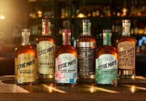
Clyde May’s whiskeys and bourbons
Vintage unboxing experiences
Vintage-inspired packaging is nothing new. But in 2021, we’re seeing this trend evolve to a new level, with authentic unboxing experiences to make customers feel they have stepped back in time. This involves going beyond logos and labels to leverage textures, materials, bottle shapes, outer packaging, and imagery to encompass every single packaging element. Clyde May’s range of whiskey and bourbons use traditional bottle shapes, wooden stoppers, and embossed labels to suggest these spirits never left the 1940s era in which they were created.

Dogfish Head Craft Brewery x Indigo
Hyper simplistic geometry
Another visual trend set to dominate beer and spirit packaging in 2021 is designs that feature bold geometric concepts—neat lines, sharp angles, and striking colors—to make a lasting impression on customers. While these designs can be viewed as abstract, they still give drinkers a sneak peek at what the product stands for. The use of a green color palette and geometric but natural shapes on Dogfish Head Craft Brewery’s traceably-sourced beer, for example, effectively communicates that Re-Gen-Ale takes Mother Earth into account.
Organically shaped color blocking
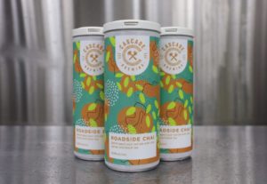
Cascade Brewing Roadside Chai red ale
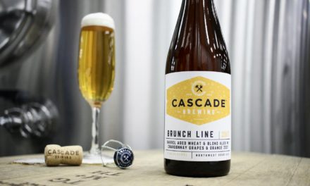
You can also expect to see increasing numbers of alcohol brands putting a new twist on classic color blocking designs. What’s different this time around is the textures, unique color combinations, and unbalanced shapes, overlaid with unexpected lines, dots, and squiggles—all of which seem to take inspiration from elements found in nature. Cascade Brewing makes great use of organically shaped collages on its Roadside Chai red ale, which features collections of lines, tiny dots, and triangles to give the cans a soft, organic feel.
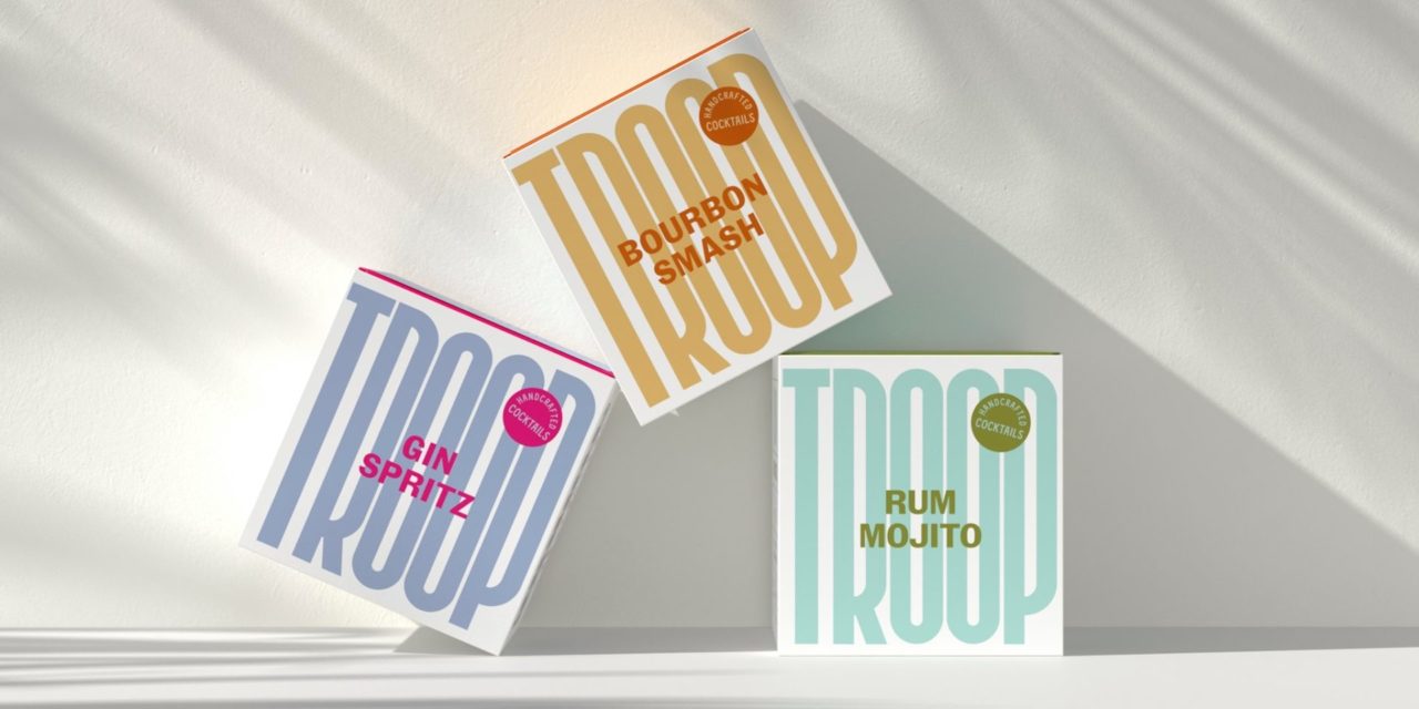
Product names front and center
Troop Handcrafted Cocktails
Leveraging strong typography to carry the brand’s whole aesthetic, by placing the name of a product center stage, is also becoming increasingly popular. By doing so, customers can easily see exactly what the drink is with a quick glance. For those looking to launch something new in 2021, this can be a great way to increase brand awareness. Troop, for example, uses a contrast of muted and bold colors to make its product names pop against its logo on a range of handcrafted, ready to drink cocktails
These designs represent just a handful of trends set to shape the packaging world in the new year, So whether you’re looking to launch a new product or simply refreshing some existing branding, consider tapping into one or more of these to ensure your products truly stand out.

Shayne Tilley is head of marketing at 99designs, a global creative platform that makes it easy for designers and clients to work together to create designs they love. He’s a wrangler of collaboration, diversity, and creativity who works to bring more opportunities to people all around the world.


