You’ve produced something you feel is particularly outstanding—a magical wine, a distinguished spirit—so why package it in an off-the-shelf bottle or design? Today, the possibilities for showcasing your brand are endless if you start by focusing on how it’s presented, be it with a custom bottle, package, or choice of material.
Connecting with consumers

David Schuemann, owner and creative principal, CF Napa Brand Design
David Schuemann, owner and creative principal, purchased CF Napa Brand Design in 2001 and refocused the brand design firm exclusively on alcohol beverages. With such long-held focus, he’s become not only a master at spotting current trends, but also at seeing what lies ahead. “The talk of the business right now is augmented reality labels,” he says. “It’s where phone apps can scan a label to bring it to life. Some examples are 21 Crimes and The Walking Dead wines.
“Just the tip of the iceberg has been scratched,” he continues. “The next innovators will include beneficial information such as food pairings and recipes, so people can scan the labels at home. For serious wines, I see the opportunity for winemaker notes, where the winemaker can talk about how particular vintages are tasting that year. There’s huge potential to connect with the consumer on a deeper level.”
 He also cites brands that have smashed category assumptions, such as Stewart Cellars’ Slingshot wine labels, which CF Napa designed for the company. “Its label has a large bull’s-eye with a hole blasted through it,” says Schuemann. “The Slingshot cabernet sauvignon sells for less than $30 and lives up to its tagline, ‘Irreverently made in Napa Valley.’ It proves a great Napa Valley wine doesn’t have to have a banal label or cost a fortune.”
Another development he points to is the ability for producers to customize on a smaller scale. “The use of digital printing has grown significantly for small to medium producers,” he says. “It offers the ability to affordably print labels for smaller productions and include variable information on each label; the labels can be a series of varying designs or information in a single case.”
He also predicts the movement toward tactile labels will continue to grow. “There are wood veneer and cloth label materials available now that will push the limits even further,” he says.
With so many options available, embrace your chance to push the envelope and ensure your brand stands out from the rest. Here are several examples of what design innovators have created thus far.
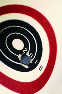
“Even if you’re a small producer, it’s wickedly difficult to do your own bottle design.” —Ian MacNeil, Glass Distillery [© Jerry and Lois Photography; courtesy Glass Distillery]
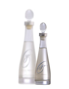
When founder and chief distiller Ian MacNeil launched Glass Distillery in 2012, he knew he had to differentiate his product to be successful, especially against bigger players. His flagship product was already unique: Glass Vodka is distilled from Washington state winegrapes (Glass is headquartered in Seattle), crafted with a nod to the environment, and named for the area’s master glass blowers. Its bottle design uniquely reflects the smooth, clean spirit inside.
“Even if you’re a small producer, it’s wickedly difficult to do your own bottle design,” says MacNeil. “We did it anyway, because we knew it was the best way to stand out.”
He started with weight; at 985 grams, the crystal container is heavy and reminiscent of a white Bordeaux wine bottle at the bottom, which curves up into a decanter design at the top. A buckle-like chrome collar holds the egg-shaped stopper in place.
Glass Vodka
Challenge: Reflect the premium winegrape spirit base
Solution: Custom decanter with minimal verbiage
Takeaway: Eye-catching presentation leads to recognition in the market
“I wanted it to have the look and feel of traditional vodka—tall, slender, and elegant, but also feel special to pour from,” he says. “There are no straight lines and only the bottom is flat. Inside the neck is concave so you can pour cleanly, and what isn’t poured flows back into the bottle. You can reuse the bottle as a decanter and it won’t drip, even with wine.”
The printing is only what the TTB requires so the design remains clean and simple. The chrome GV script is one continuous line, which consists of hundreds of layers to create a three-dimensional effect. The rest of the print is ceramic/metallic ink that can’t be scraped off. The bottles are manufactured from custom molds in Guang Zhou, China, where some of the finest crystal in the world is made.
“I can’t stress enough how important packaging and bottle design is in brand building,” says MacNeil. “We’re going for the consumer who wants to buy something that looks like a gift. It’s super premium without being too expensive or kitschy.”
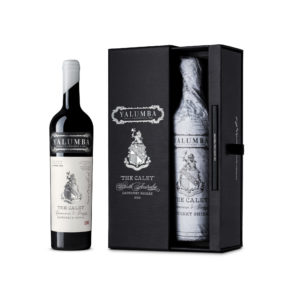
Yalumba: The Caley

“We delved into Caley-Smith’s history and had the idea to use his journey to connect him with the wine.” —Rowena Curlewis, Denomination
What does a winery do when two particular parcels are so extraordinary that the wine crafted from those grapes is deemed one that took 165 years to make? For Robert Hill-Smith, owner of Yalumba winery in Australia, it meant creating a new flagship product that would elevate the winery’s premium positioning. He named the 2012 cabernet sauvignon-shiraz blend The Caley, a nod to his great uncle, horticulturist and adventurer Fred Caley-Smith, who, in 1893, traveled the world meeting with other horticulturists, taking cuttings and planting material, and promoting Yalumba wines. It was a project that called for outstanding packaging.
“We delved into Caley-Smith’s history and had the idea to use his journey to connect him with the wine,” says Rowena Curlewis, CEO and co-founder of Denomination, a design firm with offices in Sydney, London, and San Francisco, which focuses exclusively on alcohol brands. The design process from concept to completion took about four months.
“Hill-Smith wanted to use the family crest as a starting point,” she says, explaining a decision to use typography and embellishments that would have been used at the time of the journey. Caley-Smith’s signature is included on the label in faded brown ink, and its back label details his journey.
The Caley
Challenge: Introduce a flagship-level wine release while remaining true to your roots
Solution: Double-down on ancestral lore for historical graphics and ancillary elements
Takeaway: Know your story and tell it at every opportunity
The wine is wrapped in tissue paper printed with a world map, noting all the dates and places he visited. It comes in a box that also includes a small, hardcover book with information about Caley-Smith’s journey and how he brought back knowledge about viticulture—and how those learnings have influenced how Yalumba works today. It also includes some of the photos he took, documenting the cultures he visited, as well as letters and journal entries he wrote.
Denomination worked with MCC Global Label Solutions to create a label that’s foiled, debossed, and embossed on thick Italian paper stock, creating a multi-textured finish with typography that feels raised. “They did the most fantastic job,” says Curlewis.
Only 500 cases were produced and were priced at three times the cost of Yalumba’s previously most expensive offering. “It’s heartening, because Yalumba never had a wine as expensive and well-awarded as this,” says Curlewis. “It spoke to a different market—and sold out in only nine months.”
Lucky for the winery, the 2013 vintage offered an equally outstanding lot, allowing a soon-to-be released second offering of The Caley.
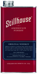
Stillhouse
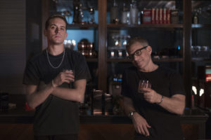
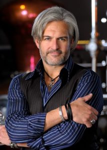
“There was a void in the spirits category, in that no one had created packaging that was unbreakable.” —Brad Beckerman, Stillhouse Spirits Company (right, with G-Eazy)
In 2016, Brad Beckerman, founder and CEO of Stillhouse Spirits Co., wanted to package his company’s clear whiskey in a way that hadn’t been done before. “We set out to create something disruptive, functional, timeless, and classic—not just a gimmick,” he says. “There was a void in the spirits category, in that no one had created packaging that was unbreakable.”
The tag line, “We go where glass can’t: everywhere,” succinctly describes what Beckerman calls the “unbreakable spirit” that evokes both his and his company’s energy.
Stillhouse Spirits
Challenge: Reflect the “unbreakable spirit” of the brand, the product, and the consumer
Solution: A timeless, go-anywhere container
Takeaway: Deliver your brand’s personality with a style that’s all your own
Beckerman went for an industrial look using stainless steel, because distillers have been using giant stainless steel VATs to store whiskey for many years. “It evokes the industrial revolution,” he says, “when packaging was about function.” One measure of the can’s functionality is that it has a smaller shelf footprint than a standard glass bottle; two of Stillhouse’s 750mL cans take the same amount of space as one 750mL bottle.
The process from idea to completion took about 18 months. The customized look is put together with a heat and pressure process that self-molds. The company’s whiskeys come in red cans, while its black bourbon comes in matte black. “People have an emotional connection to color,” he says, noting how many sports teams use red and/or black (Beckerman’s career began in the sports merchandising industry). The cans are 750 mL, with a smaller 375 mL size called “Roadies,” likely a nod to Beckerman’s background in the music industry (he’s former chief creative officer for Live Nation, an American events promoter and venue operator).
In 2017, Beckerman welcomed Oakland, Calif.-bred musician G-Eazy as investing partner and co-creative director. “It was serendipitous,” he says. “I was introduced to G-Eazy through my friend, music legend Gee Roberson, who also happens to be one of his managers. When G and I first met, we bonded over so much—sushi, Johnny Cash, and whiskey. We just vibed, it was an instant connection. He’s authentic, charismatic, and insightful. The energy he brings to the table is infectious, and he complements Stillhouse like no other.”
Beckerman continues, “When you look at the music culture, that’s the kind of energy Stillhouse embraces. All kinds of people like it. It’s a fully multicultural, multidimensional brand. It’s about having fun.”
In early Spring 2019, Stillhouse will debut something major, which Beckerman says will take the company “beyond a whiskey brand.”

“We try at every turn to build a brand around authenticity, which resonates with our customers.” August Sebastiani, 3 Badge Beverage Corporation
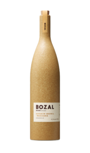
Bozal Mezcal
Once considered low-end, mezcal is now considered an ultra-premium offering. “People are learning there are different varieties, terroirs, and flavor profiles,” says August Sebastiani, founder of 3 Badge Beverage Corporation, which has been producing Bozal Mezcal since 2016.
The spirit is crafted in Oaxaca and Guerrero, Mexico, and its custom ceramic bottles are a nod to Mezcal’s heritage. “Historically and traditionally, the way to drink Mezcal is out of a terra cotta cup called a copita,” says Sebastiani. “We’ve replicated the clay with our bottles and we make copitas out of the same material. They’re all hand-painted and produced in Mexico City.”
Bozal Mezcal
Challenge: Introduce mezcal to a mostly unfamiliar audience and establish it as a premium spirit
Solution: Reimagine traditional resources to reflect your brand’s heritage
Takeaway: Listen to your designer
The bottles’ flecked paper label with an embossed logo is meant to subtly convey the product’s tactile nature. “We try at every turn to build a brand around authenticity, which resonates with our customers,” he says. “For the closure, we wanted something simple and basic, so we used a cork, which adds to the rustic style. The bottle shape is similar to a wine bottle, which adds some elegance and helps it stand out on the shelf or behind the bar.”
Each type of Bozal Mezcal produced (there are four tiers) comes in a different color bottle. Ensamble (ochre) is a blend of espadín, barril, and Mexicano maguey. Cuishe and tobasiche (blue) is single-variety magueys that are a bit flinty and steely. Sacraficio (brown) is distilled in traditional fashion with nuts, fruit and meat (including lamb, chicken, and pork) inside the still. Reserva (black) is rare maguey varieties distilled in clay pots.
Sebastiani worked with Swig Studio in San Francisco to create the package design. “I like to let the designers do their job. They’re the experts,” he says. “I really enjoy Swig’s process and design sense. They understand the artistic side as well as cost and logistics. At 3 Badge, we pride ourselves in letting the designers showcase their talents. Swig speaks the language beautifully. They roll up their sleeves, see the big picture, and drill down to what works.”


