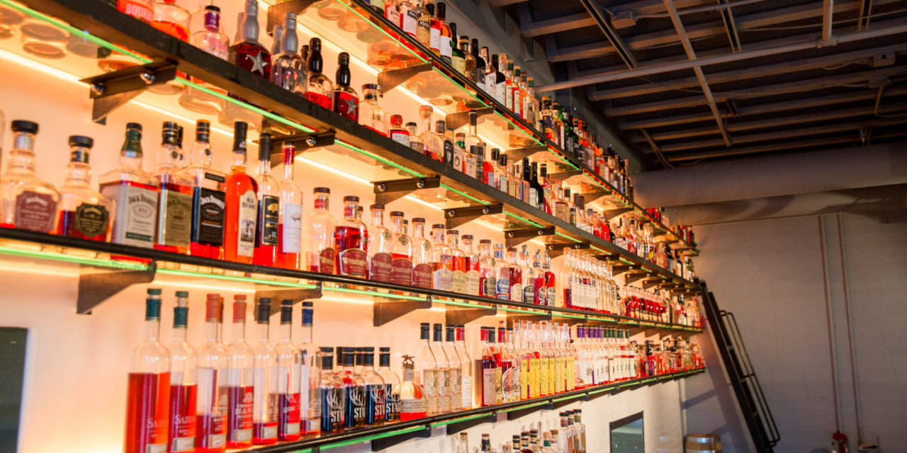
Spirits producers face an extravagant choice when it comes to bottle shapes and designs. Glass vendors offer liquor bottles that are tall, fat, round, square, smooth, nubby, colored, and customized into about any shape imaginable (provided one has the ability to write a hefty check).
The reason is simple: A bottle is a billboard. A distinctive, appealing bottle can give a distiller a marketing edge on liquor store shelves and backbars. But bottles are, essentially, utilitarian vessels. Make it impractical and you’ll hear about it from bartenders. Worse still, you won’t hear—you’ll just get buried in a cabinet or marooned in the stockroom.
This may come as a shock, but bartenders have opinions. I solicited pet peeves, and in less than 24 hours, I received more than 100 replies on an online form—rants, mostly. Here are some things to consider when bottle shopping.
Clear your throat. Standard speed pourers fit standard bottles. If you go with a wider or narrower throat, you risk aggravating an otherwise friendly bartender. “Always a standard diameter throat! No exceptions,” writes one put-upon bartender. “The pourer/spout/whatever your bar uses should NEVER fall out because of a non-standard throat.”
Don’t feel bad about your neck. The bottle’s neck is often a handle — high-volume bartenders like to pick it up and upend it in one move. “I just hate short necks,” grouses one. “I like gripping underhand and swinging up quickly.” Bottles such as Patron and Chambord are enemies of the efficient bar. “My favorite bottles to pour from are bottles like Tito’s, Pimm’s, and Sailor Jerry,” another bartender wrote, each of which have ”a bit of a thicker neck, but long enough where your hand fits around it comfortably.”
Avoid the sideways shuffle. A wide, flat-fronted bottle is a great advertisement when manspreading across the backbar. Problem is, it takes up more than its share of acreage so is often likely to get shelved sidewise, rendering it invisible. If you insist on going this route, take note of Knob Creek, which has a prominent side label that can still be found amid the crowd; Woodford Reserve and many others miss the mark.
Don’t be so opaque. Bartenders must periodically inventory their stock, holding up each bottle and estimating contents. So why would you design an opaque bottle? Bartenders expressed special loathing for Hendrick’s gin and its black bottles (with stumpy necks). “Hendricks, stop making it impossible to do your bottle count,” says one. Adds another: “I shouldn’t have to take the top off and shine a light down the top!”
Be well aware. Do you hope to get your product in the bar’s well for easy access and higher volume? Then plan for it. Some high-volume, high-stature producers have intentionally designed their bottles to not fit in the well, reasoning that they’d rather be on the backbar for higher visibility. That’s a risky strategy.
“If your bottle is less than $50 retail, make it fit in a well rail,” writes one bartender. “I get that you want to be different and ensure you’re on our back bar, but all it does is piss us off that it doesn’t conform to our hands and wells—that makes us not like selling your product.”
Another bartender dares to dream: “I wish all well/call bottles were shaped uniformly, preferably a squared off bottle [think: Jack, Jim, and José] because they fit so perfectly into a rail.”


